ONE ATMOSPHERE 33
BRANDING & UX/UI DESIGN
.png)
SOLO PROJECT
DESIGN OPPORTUNITY
An applied arts research lab has been founded, needing a fellow to design branding and a website.
ROLE
Art Director
Brand Designer
UX/UI Designer
DESIGN CHALLENGE
This lab is starting from scratch and there is no previous branding to launch off from. I first must decide what their needs are as a brand and how I can fulfill those needs in a visually pleasing way.
DURATION
SOLUTION
4 Months
A distinguishable brand system and website where visitors can learn more about the lab and environmental conservation in general.

PROCESS
01.
About
Application Process
My Roles
02.
Market Research
Brand Strategy
03.
Brand Design
04.
Web Design
05.
Takeaways
01.
ABOUT THE FELLOWSHIP
One Atmosphere 33: Environmental Image & Storytelling Applied Arts Research Lab at FIT is for those interested in exploration, innovation, creativity, and activism to be part of an applied-arts research team to create positive social change. Visual stories can spark imagination and are one of the most powerful forms of communicating and connecting with the public. As part of this fellowship, the fellows research environmental issues, conduct interviews and experiment with an array of storytelling ideas.
MY ROLES
I was the lead and solo Brand Designer, Art Director, and UI Designer.
02.
BRAND STRATEGY
WHAT IS OUR BRAND ENEMY?
ARTIFICIAL
WHAT IS OUR ONE AND ONLY?
One Atmosphere 33 develops compelling visual stories that help communicate complex environmental issues to create positive social and environmental change.
WHAT IS OUR INTENTION AS A BRAND?
To embrace storytelling to raise environmental awareness and action to protect our atmosphere, wildlife, and planet.
WHAT IS OUR LASTING IMPACT?
Changing public perception of the environment to create a better world.
WHAT IS CONSISTENTLY TRUE AND INHERENT THROUGHOUT OUR CONSUMER EXPERIENCE?
The visual arts are a powerful tool for building an emotional connection to protect and restore our most precious resource: Planet Earth.
ARCHETYPES
THE HERO
60%
THE CAREGIVER
25%
THE SAGE
15%
PERSONALITY TRAITS
Kind, Ethical, Creative, and Honest
BRAND PURPOSE
Encourage humanity to make thoughtful and intentional choices to protect our planet.
03.
BRAND DESIGN
THE STORY
Keith was on an assignment in the Azores (off the coast of Portugal). While freediving within the crystal clear cobalt blue ocean, a pod of dolphins descended beneath him. One dolphin exhaled. The bubbles ascended past his lens and to the surface, releasing an imaginary communication between two intelligent beings desiring a deeper connection. This formed the inspiration for One Atmosphere 33, our icon, typography, and color palette.
Our icon, respira, is a visual representation of a fleeting breath in the ocean that was inspired by the dolphin. The outer shape is created by a combination of O and A merging into a single form. The inner shape integrates the number 33, which refers to a depth of 33 feet, also known as one atmosphere. This graphical element is abstracted and encapsulated within the design, and complemented by the written word.
MAIN LOGO
.png)
MAIN LOGO VARIATIONS


Our logo is the face of us and everything we do - we knew we had it to make it meaningful. The O, A, and 33 were placed together in a way to make them all interconnected: just like the beautiful earth we live in. Different shades of blue were placed together not only to create dimension, but to echo our focus on the ocean and the movement of a wave.
=

COLOR PALETTE

Color Treatment True Blue: The ocean absorbs the color red giving it a beautiful blue tonality. By adding red underwater (via a strobe), it illuminates a full-color spectrum. We developed a flash of red to emphasize the infinite possibilities of color.
DYNAMIC BRANDING
LOGOS


PALETTES

One of the most important parts of the One Atmosphere mission is the research behind the work. Without data from nature, we could not possibly help our environment correctly.
PATTERNS
Therefore, this branch receives the main color treatment since research is the DNA running through every project we create. It is based on fact, like how red light is what makes the ocean blue.
Storytelling is paramount at One Atmosphere. Thanks to all of our research, we are able to communicate a story to the public, trying to change perceptions about the environment. We use this palette because the blue oceans and green trees surround us in our environment.
Color Treatment Mother Nature: On land, the rainforests, and at sea, plankton, are responsible for producing the majority of the oxygen we breathe. They are the inspiration for this color treatment, resulting in our colors: tree frog green and bottlenose dolphin blue.
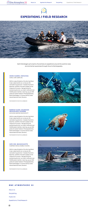
The third aspect of our mission is actually going out into nature and connecting with the environment we are trying to save. Our founder Keith has gone on many expeditions, so it helps us have a first-hand account of what we are speaking about. This palette is used as each day we see the sun shining down on us, keeping our earth alive and well.
Color Treatment Sun Kissed: Earth is dependent on the sun for life. The sun's rays produce visible light, which we perceive in ROYGBIV color. This inspired our yellow-orange palette, which is an amalgamation of the ever-changing hue of the sun over time.
05.
TAKEAWAYS
OVERALL
-
Honed my time management skills by creating lists and schedules
-
Improved my communication skills from participating in dialogue to further the design process and speaking with industry professionals
-
As a designer, I learned to be diligent, patient, consistent, and to pay great attention to detail
It was a reminder to always be empathetic, not
only when designing, but also just in general.
I learned so much about environmental conservation and it was an honor to be able to be apart of changing public perception of the environment.
x


